Articles about webdesign
Viewport-relative, scalable text
When creating fluid designs, controlling the line length is a challenge. You don’t want your lines to expand indefinitely, making them unreadable, even if the layout can expand indefinitely. This article details how I solved the problem on mentalized.net.
Nested properties in Sass
I have been using Sass for ages and I never realized I could do:
margin:
  top: 1em
  bottom: 2em
and have it compile to:
margin-top: 1em;
margin-bottom: 2em;
This is a great timesaver for all those background-image, margin, padding, border declarations.
Designers solve problems - what do developers do?
Squeezing UX design into an agile process is hard. I think so and Joshua Porter thinks so. He reasons that this is because “design is about solving problems”, and solving problems cannot be squeezed into 2 week iterations.
Hm. I wonder what that says about developers?
CSS, links, gradients, rounded corners, and IE
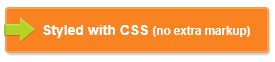
On a project we were recently given a nicely designed button that we should implement.
No problem, I thought, that’s doable using CSS3. Behold, it was (non-interesting styles like font color and size are removed for clarity):
HTML
<a class="button" href="#">
  Styled with CSS <small>(no extra markup)</small>
</a>
CSS
.button {
  background-color: #f98221;
  background: linear-gradient(top, #fec848, #f87d1a); /* Add vendor prefixes as needed */
  border-radius: 4px;
  border: 1px solid #eca253;
  box-shadow: rgba(0,0,0,0.2) 1px 2px 3px, inset rgba(255,255,255,0.7) 0 0 4px;
  display: inline-block;
  padding-left: 1em 36px 1em 18px;
  position: relative; /* Allows for absolute positioning relative to this element */
  text-decoration: none;
  text-shadow: rgba(0,0,0,0.3) 0.1em 0.1em 0.1em;
}
.button:before {
  background: url('icon_arrow_green.png') 50% 50% no-repeat;
  display: block;
  content: '';
  height: 100%;
  left: -2px;
  position: absolute;
  top: 0;
  width: 31px;
}
There was much rejoicing until the big blue elephant in the room reared its ugly head and pooped all over my nice and clean markup. Thank you, IE, so much.
How to create a ribbon effect in CSS
When I was implementing the design for Hvad Bruges Pengene Til I figured it would be interesting to create the ribbon effect using pure CSS.
Pepper - a Redmine theme
You develop great software. You use Redmine to manage your projects. Your Redmine instance should look at least as high tech and sleek as the software you develop.
That can now be fixed, using my newly released theme, Pepper.
Experiment: PileUp Carousel
HTML5, CSS, JavaScript, hardware accelerated 3D transformations – this post has it all. Oh, and a live demo.
I recently had the idea of a photo carousel resembling a pile of photos being shuffled from one side of the screen to the other. The goal was to use as little JavaScript as possible and rely on CSS transitions instead.
Firefox 4 default stylesheets
If you ever find yourself debugging some odd Firefox only issue, you might be able to find some clues in the default stylesheets of the browser.
If you navigate to resource://gre-resources/ in Firefox 4 you’ll find a list of various resources used by the browser.
Removing focus outlines
In order to make it possible to navigate a website using the keyboard, browsers put an outline around the currently focused interactive elements, like links, buttons and form fields.
Firefox uses a dotted outline for links, and a blue glow for input elements. Chrome and Safari on OS X use a blue glow for everything. Many people don’t like those.
Browser widths again again
As someone who has been rambling about the irrelevance of screen resolutions and the importance of browser sizes for years, it is always a pleasure seeing other people get the point.
The other day I was pointed at Liquid Fold, a project that “will provide you a handy set of graphs showing a breakdown of your visitors’ browser sizes”. Anything that improves visibility of this important metric that most statistics packages fail to report is a Good Thing.
The UI element that broke the users back
There it is. Your marvel of an interface. Clean, de-cluttered, easy to use. Steve Jobs would hire you if he saw this. Nah, he would be too gobsmacked to hire you. Yeah, that’s right. You’re the master of simpl…
The sound of your ringing phone pulls you out of your self-congratulatory bubble.
It’s the boss. He’s loving the interface, but wondering if it would be possible to add just a tiny element, it’s not much, just an link to like the page on Facebook, no big deal.
On Flash, layers, and HTML5
A common problem when embedding Flash elements on a website is where the Flash content insist on being shown on top of all other overlapping layers of content. For example if you want to show photos in a lightbox on a page with Flash ads, you see the ads bleed through the lightbox and photo.
This is a known problem and the fix is generally to set wmode to opaque or transparent depending on your needs. Problem solved.
That’s what I though when I ran into the problem on eventzonen.dk. It turned out to be not that easy.
5 reasons to not use HTML5 right now
HTML5 is the new version of HTML and XHTML. As always when a new technology comes out, in particular one that’s meant to replace what we know and -love-use, there are plenty of excuses to not progress and adapt the new technology.
I hereby give you 5 reasons to not use HTML5 for your websites today – and the reasons they are wrong.
Recession proofing your webdesigns
As part of my work at Substance Lab I occasionally get to chop a design (usually a Photoshop document) into pieces and implement it in squeaky clean markup and CSS.
Unfortunately some of the designs tend to be more complex and use visual treatments that are hard to use on the web, and as a result the implementation of the design takes longer, costing the client more than what’s really necessary.
The following are a few tips that’s going to make it easier and cheaper to build a design for the web. Coincidentally, some of them will even make your website design better!
Don't use placeholder text as labels
One of the form field enhancements coming in HTML5 is the placeholder-attribute:
The placeholder attribute represents a short hint (a word or short phrase) intended to aid the user with data entry. A hint could be a sample value or a brief description of the expected format.
Not a new concept by any means, but it’s great that it’s being formalized and supported by browsers. The HTML5 spec then goes on to say:
The placeholder attribute should not be used as an alternative to a label.
This is important because the placeholder text gets removed as the form is being filled out and your form needs to be usable even when your placeholder text is not there.
Webdesign critique: Cooper.com
A problem with companies becoming ever more aware of and adept at social media is the fact that it’s become hard to whine about some company without instantly having a representative asking you what’s wrong. Some times you just want to whine.
This is roughly what happened after I tweeted my dissatisfaction with the new Cooper website.
Okay, fair enough, I’ll spend some time going over some of the issues I found.
Your browser wants its back button back
The other day I was playing around with a potential design for a little something I’m working on. After messing about in Photoshop drawing a button that would take the user back to the previous screen, I had to stop and ask myself the million dollar question: “Why?”
Explaining progressive enhancement
Trying to explain progressive enhancement (or graceful degredation, for that matter) to someone that isn’t used to dealing in abstraction layers, interfaces, and presentation formats, is near impossible.
Not surprisingly, most clients fall in that category.
Game consoles
Paul Stanton suggests using games consoles as an analogy for progressive enhancement and while I see the appeal of that analogy, it does have some huge flaws (like any good analogy), so I tend to go another route.
The case against single line CSS
More is better – at least when it comes to lines of CSS. I personally prefer putting each CSS rule on their own line in my CSS files, but some people have advocated the use of putting each of your CSS rules on a single line, like so:
#wrapper            {width:800px; margin:0 auto;}
#header             {height:100px; position:relative;}
#feature .post      {width:490px; float:left;}
#feature .link      {width:195px; display:inline; margin:0 10px 0 0; float:right;}
#footer             {clear:both; font-size:93%; float:none;}
This single line approach makes it easy to scan through a stylesheet and find the selector you want to modify. But that’s also about as far as the benefits go for this approach.
Redesign: Børn i byen
I totally forgot to mention this when it actually went live a few weeks back. At Børn i byen we’ve been busy redesigning and changing things around, and the result is now live at bornibyen.dk
Webkit-based Xbox dashboard
Webkit – and Safari in particular – have been really aggressive in adding support for upcoming CSS 3 features – and some CSS features not yet part of any spec.
As much of this is still Webkit-specific it isn’t really something I get to use much on client work, but not being one to shy away from new, shiny things, I though it would be fun to dig into this.
I decided to recreate an interface familiar to Xbox players, namely the Xbox Dashboard. It seemed like a good candidate to try out techniques like CSS animations, font-face, multiple backgrounds, gradients, RGBA colors, drop shadows, and custom scrollbars to name a few.
Browser size awareness at Google
I have been preaching the importance of measuring browser width rather than screen width for quite some time now. Unfortunately, people still focus in the size of the users screen when they discuss website design widths.
I don’t blame them. Most web analytics packages don’t provide us with a metric that tells us the viewport widths of our users, and as humans we are likely to grasp onto the metrics that is available to us, not necessarily those that are important.
A tiny sparkle of hope has now emerged in a sea of ignorance: Someone at Google figured out that people browse the web with differently sized browser windows.
The result is a small tool to visualize what percentage of users can actually see a given area of your website without having to scroll: Google Browser Size
The tool is still pretty crude – as the comments to the introductory post clearly tells – but in time it could get really useful. If nothing else, it can hopefully be used to open the eyes of clients and designers.
All I am waiting for is getting this rolled into Google Analytics, preferably instead of the useless Screen Resolution metric.
Using Google Page Speed to optimize websites
Back when Yahoo! released their YSlow add-on for Firebug, I took it for a spin and optimized biq.dk using it.
Google recently released their variant of YSlow called Page Speed. Like YSlow, it’s an add-on for Firebug and it provides a bunch of recommendations for optimizing the clientside performance of your websites. This time, I’ll let it loose on the homepage of Lokalebasen.
Testing HTML emails with Rails and Litmus
Every so often, a client wants their web application to send out emails that could benefit from a bit richer styling than what’s provided with your basic text emails. Occasionally, they’re right, and you find yourself walking down the path of HTML emails. But beware! That path is perilous and behind every corner lurks the big, all-consuming monsters of HTML emails; Email clients.
Size still matters
A couple of years ago (wow, has it been that long already?) I posted the results from my research into browser viewport widths, Size Does Matter.
Back then, I pointed out that basing your designs on the width of the screen was pointless. Far from every visitor would actually use the full width of their screen for their browser – only 66% on average. The wider your screen, the less likely you were to maximize your browser.
Even though massive flatscreen monitors regularly appear in cereal boxes and as Kinder surprises these days, the reality isn’t much different from what it was 2 years ago; Make your designs wider than 800 pixels and expect a good chunk of your visitors to get a horizontal scrollbar.
Choosing a design width
When determining what width to give your design the primary goal must be that as many visitors as possible should be able to view the entire design without getting a horizontal scrollbar (scrolling horizontally is bad, mmkay).
The following chart shows the percentage of visitors that will not get a horizontal scrollbar for specific pixel widths. It also shows the figures from my 2006 study:
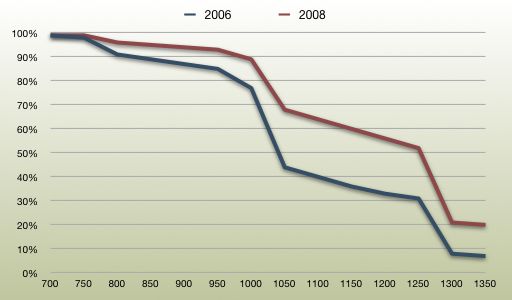
It’s interesting to note, that the available width has clearly increased since 2006. Back then, if you were to make your design 800 pixels wide, roughly 10% of your visitors would get a horizontal scrollbar. Today, that number is around 5%. It’s getting easier to justify going above the 800 pixels mark.
Another interesting thing to note is the two steep drop-off points occuring in both graphs after 1000 and 1250 pixels. Both of those correspond pretty well to a maximized browser in the two most widespread screen widths; 1024 and 1280 pixels.
The remnants of a drop-off is also visible right before the 800 pixel mark, but it’s almost not visible indicating that 800 pixels wide screens are becoming a thing of the past.
What does a smart designer do?
The above numbers are based on my statistics gathered from mentalized.net. A smart designer will obviously measure this on the actual site in question before making a desicion.
Unfortunately, many statistics packages still only provide the useless screen size metric instead of the useful viewport width one. Mint is still the only one I know of that tracks viewport widths – and that’s through a plugin pepper.
What does a lazy designer do?
If you’re stuck with a statistics package that doesn’t provide you with the figures you need to make a decision, you’ll have to settle for my advice – just like I did when designing the Substance Lab website (a rare case of me doing what I say, I admit).
Back in 2006 I recommended that you “optimize your designs for a width of 770 pixels while making sure they scale […] to 960 pixels”. Now, more than 2 years later, that recommendation hasn’t changed much, unfortunately.
With a design width of 770 pixels only 2% of your visitors should encounter the dreaded horizontal scrollbar. At 960 pixels, the number has climbed to 7% – that’s 1 in every 14th visitor.
Personally, I don’t see the value in optimizing for 2% of my visitors. I wouldn’t, however, be happy knowing that 7% of my visitors were getting a less than optimal experience. You have to decide for yourself – and for your customers – where your accepted cut-off point is.
Side job versus dayjob
I have been moonlighting as a freelance webdeveloper for the last couple of years. The first year, I was using my spare evenings and weekends until I began having trouble finding enough time to dedicate to new projects.
My reaction was to cut down on my dayjob, leaving me with more time to focus on my own clients (and less time to focus on BiQ, forcing us to hire another developer).
Double u double u double huh?
It’s about time we kill the “www”. I don’t mean the World Wide Web, obviously, but the three letters that appear at the beginning of a plethora of website addresses.
Seen from a human perspective they serve very little purpose these days. Sure, many people believe they are required – and in some cases they are due to technical oversights – and will happily enter them in the address bar.
It could be argued that they make it easy to recognize a website address. I agree, everybody recognizes “www.example.com” as a website address. However, my guess is that people are just as likely to recognize “example.com”. The dot and the 2-4 letters following it are what makes a website address – both on a technical level, but also in peoples minds.
Why it’s bad
The World Wide Web is the only thing I know of whose shortened form takes three times longer to say than what it’s short for.
What's the definition of definition list?
According to the HTML 4 specification a definition list can be used to mark up dialogues. Mark Norman Francis objects to this, and in “his article on 24 ways” he goes on to claiming that using definition lists for anything but glossaries, lexicons and dictionaries is a crime against markup:
Living by the specification, a definition list should be used for term definitions
Using YSlow to optimize websites
Yahoo! has released a great Firefox addon – or rather, an addon for a Firefox addon – called YSlow. YSlow allows you to analyze and suggest improvements to various performance metrics on the website you’re currently visiting.
For kicks I decided to let it loose on biq.dk. Unfortunately it gave me a disheartening grade of F:
Performance grade: F (46)
Ah well, sounds like a perfect opportunity to improve, and the rest of this entry contains the areas where the biq.dk frontpage did not receive an A-grade, and a description of the modifications I had to perform on our setup to satisfy the addon.
Launch: BiQ on Rails
After 6 months of evangelizing and advocating, followed by 6 more months of rewriting, and then 3 more months of building new features and enhancing existing ones, we have finally launched the new version of BiQ.
Going from ASP/VBScript on Windows 2000 and IIS to Ruby and Rails on Debian served with love by Apache proxy balancing to a Mongrel backend, using memcached for relieving the database of those common queries, with continuous integration provided by Cruise Control and easy deployment through Capistrano sure as heck feels good.
Add to that the fact that the new look is quite delicious and powered by standards compliant XHTML sprinkled with a tiny amount of Ajax and a hint of microformats and Atom feeds, and has a blog and some new killer features and you’ll probably understand why I am happy.
Now it is time to make the site even better. ;)
A small part of me on wow-europe.com
Considering I am a World of Warcraft player and previously pondered applying for a webmaster position at Blizzard Europe but decided against it due to not feeling like moving to Paris, it’s pretty cool to notice that a small part of me have still made it onto the World of Warcraft website.
Their new World of Warcraft game stats page uses one of my activity indicators to, well, indicate activity.
Blizzards spinning ball is clearly the same as mine, and has most likely been lifted from Napyfabs collection.
Putting stuff into the public domain and seeing it pop up in unexpected places like this is extremely cool and has so far been my favorite thing about putting together the collection of animated GIF progress indicators.
Browser widths continued
The whole issue of browser width vs screen width vs line lenght vs fluid layout vs elastic layout vs fixed layout is getting some airtime once again, this time over at Roger Johansson blog, 456 Berea Street.
Roger Johansson mentions a couple of interesting links, including one study based on browser width figures gathered by mint (like I suggested one should). His article bears no mention of Thomas Baekdals study, though, which is a shame since that’s by far the most comprehensive one I’ve seen (yes, way more comprehensive than my own).
One thing I find surprising is how many of the commenters still insist on talking about resolutions and screen sizes. The screen size or resolution is not interesting as has been pointed out numerous places by now.
Please quit thinking it is.
Social networking works
I just received a cold call job offer caused solely by my LinkedIn profile. Pretty cool.
Unfortunately for the effectiveness of this story (and for the caller) I am pretty happy where I am these days and I turned them down.
Browser size does matter - Actual numbers
In a recent Jakob Nielsen Alertbox column Jakob Nielsen recommends that you
Optimize for 1024×768, which is currently the most widely used screen size.
Unfortunately, Mr. Nielsen seems to forget or ignore a very important detail as Jesper points out – namely that screen size does not equal the actual visible area of the browser. This article attempts to make up for Nielsens oversight.
Size does matter
I have published my report and findings on this subject .
In his most recent Alertbox, Jakob Nielsen dived into screen resolution and page layout. His summarized findings are:
Optimize Web pages for 1024×768, but use a liquid layout that stretches well for any resolution, from 800×600 to 1280×1024.
There seems, however, to be one important thing wrong with Jakob Nielsens findings: They are based on the assumption that people run their browser in a maximized window with no added browser chrome. I claim that this is a false assumption in most cases. As does Jesper over at justaddwater.dk.
Guesses and claims are interesting in their own right, but in the long wrong, they are pointless and hard facts needs to take their place. Sadly, I have yet to experience a statistics solution that display this useful piece of information. They usually just track the basically useless screen dimensions.
So I whipped up some quick tracking
Doing beats complaining, so instead of complain about the lack of usable metrics, I whipped up a quick and dirty browser viewport dimension tracker myself. It’s rudimentary, but should work for most browsers. It should also fail silently for the rest, so your visitors hopefully won’t notice.
It currently tracks screen width and height, and browser viewport width and height in addition to the client IP address and a timestamp. I plan on making the collected data freely available.
Feel free to join my little project if you’re interested in these numbers.
Here’s hoping my shared hosting account doesn’t croak under this. :)
MSDN hates Firefox
Microsoft, a company that proclaims to be devoted to web standards, has updated parts of their MSDN Library VBScript Language Reference. They’ve hidden the most valuable details of each funtion behind some pointless click-to-expand links. Apart from being a usability blunder, Microsoft once again fails to prove that they care for or have even heard of standards or other browsers than Internet Explorer.
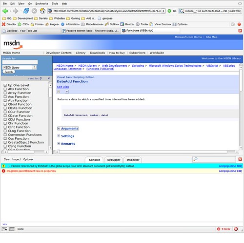
Here’s my Firebug log from simply opening the reference page for the DateAdd function.
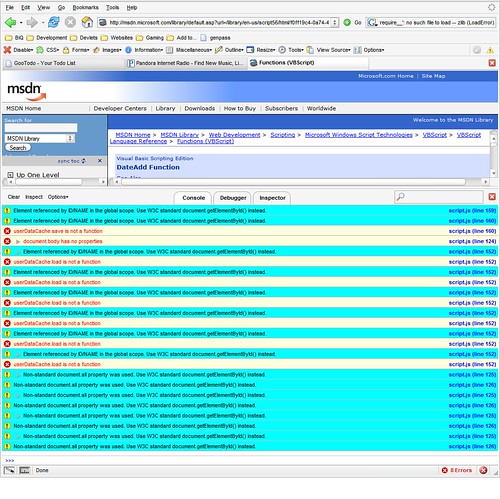
The MSDN site is now worthless in Firefox since the expand details links does not work. I for one cannot be told what the arguments mean, since this is what my Firebug log tells me when I click the link:
Microsoft, I can’t wait until I no longer have to developer using your shoddy products. It looks like you don’t want me around, anyways. Whatever happened to Developers, developers, developers or was that just Ballmer blowing smoke as usual?
Phew, Rails Day is over
After 24 hours of insane, non-stop coding, designing, talking, and general tom-foolery, Rails Day 2006 is over. Nearly 200 teams competed, committing over 5000 total changesets to the official SVN server.
My team
Even though I got a team fairly late, and our initial design/concept wasn’t fully fleshed out, I reckon we got fairly far. The application was inspired by Dan Russells post on Creating Passionate Users about visualizing your life as dots.
The application got almost feature complete, although it got far from as usable as I would have liked it to. We’ll have it deployed to a webserver near you soon. Our team stats are here, for those who care.
Is Rails Day 2007 coming soon?
Rails Day was a really cool (and tough) experience, and I had a lot of fun. Thanks should go to my teammates and our “manager” (yes, Johannes, that’s you ;) ), and to the Rails Day crew. The spectate function, SVN bots, and generally everything has been running pretty smootly, cheers! Also huge thanks to my lovely girlfriend who took good care of me all day, and didn’t even once call me crazy or roll her eyes – at least not while I noticed.
Next year, I am hoping the danish Rails community will be crawling with people so we can field a team all sitting together. That’d be extremely cool in my book. So, see you next year?
Clearing up my thoughts about DIA06
In a previous post I took a few easy and cheap shots at some danish web development agencies. I did this since their websites irked a pet peeve of mine. Unfortunately, in my eagerness to rant I ended up writing a post, that was utterly confused, drawing conclusions that were only partly cool. I apologize for the hodgepodge of that post.
I never meant to imply anything about the abilities of the individual jury members. I am sure they’ll do just fine awarding the Danish Internet. Also, I am sure they “get it” (some of them are even blogging) even though they work for companies that after a cursory glance appear not to. After all, I work for BiQ – a company with no weblog, no newsfeeds, and with validation warnings, and I still like to think I “get it”.
Also, thumbs up to Jon Lund, one of the DIA06 organizers, for noticing and replying to my post. Keeping up to date with the blogosphere and replying to negative posts is a sure sign of someone getting it.
Now, I am still pretty sceptical about DIA06 for various reasons.
Judging the judges of Danish Internet Award 2006
This post is inspired by the announcement of the Danish Internet Award 2006, sporting a 1999-style website complete with Flash intro and invalid markup (They do have a weblog, though).
I looked at the list of people from the grand jury and figured it’d be interesting to see if their companies “get it”. After all, there they are, trying to give out “danish internet awards”. Obviously these are people that has an excellent feel for what’s moving on the international scene in regards to Web 2.0, the web in general, syndication, blogging, folksonomies and what have we.
To make it fair, I only considered the websites of companies that should obviously have a clue, ie the web development agencies. For spice, I added a viral marketing agency to see how they’d stack up.
AJAX activity indicators
An important design element that’s part of the whole AJAX business is somehow letting your user know that stuff is actually happening while the server crunches away. A common way to do so, is to add a little animated GIF that is only shown when the AJAX request is happening.
Fluxiom is a web application?
Before you do anything else, go to fluxiom.com and check out their video. Then realize this; It’s a web application.
Holy crap! I can’t wait to see it in action. If indeed the interface and interaction is as the movie shows, this is probably the closest to a webbased desktop application we’ve ever been. It looks like something straight out of the Apple application shop. Go wollzelle!
Ofcourse, nothing less is to be expected with mr. script.aculo.us himself, Thomas Fuchs, on the team. He shares some more details about Fluxiom on his weblog.
Talk about raising the bar for the rest of us dabblers.
Kameo: Websites of sour
Today the website for Kameo: Elements of Power was launched. Having played the game a bit, I figured I’d visit and see what it was all about.
Here’s the story of my first visit, in the form of a thinking-out-loud usability test session. Something this website could have needed prior to being launched…
First time around
- Open kameo.com
- Huh, what is this? A location selector? Hm, I’m in Europe, so I’ll click that.
- Uh, “United Kingdom” or “Ireland”? None of those are really a good match for me. I wonder if I am not allowed to visit the site if I am from another country. No worries, I’ll commit a bit of fraud and pretend I am from England.
- Waiting for some kind of navigation to appear…
- This music doesn’t really mix well with Korn coming out of iTunes. I better kill the Kameo sounds. At least the button to do that is reasonably easy to find.
- Hm, no navigation seems to be available. Running my mouse over every element of the screen to see if anything appears clickable.
- Oh, I can click the Kameo logo in the bottom left corner, that might reveal some navigation. ::Click::
- Uh, no, that just reloaded everything.
- Screw this, this site has nothing but a pretty picture and sound. ::Close tab::
Then I thought, “Hey, this stuff will make for a good rant”…
Here we go again
- Reopen kameo.com
- Aha! This location selector is no match for my deception-fu. This time I will fake being from “New Zealand”, mate.
- Same intro stuff again. It wasn’t interesting the first time around, it sure isn’t the second time around.
- Gah, the sound still doesn’t mesh well with my iTunes. Didn’t I already turn this off?
- It seems nothing has changed now I am coming from New Zealand. Why do I have to bother picking a location at all?
- This time I wait and see what happens…
A minute is an infinity
A minute later, a navigation menu appears at the bottom. One minute! That’s more than 60 seconds of doing nothing. 60! Without an incentive I have an attention span somewhere below 10 seconds. The target audience of the game probably has even less. Why would anyone force anyone to wait that long? It gets even better: I have to wait 60 goddamn seconds each and every time I revisit the page.
Navigational pains
The navigation gives me these options: “Anger management”, “Kameo Lore”, and “Characters”. Where would you click to find screenshots? Release information? Supported platforms? Price range? Retailers? The hard cold facts that you might actually be interested in?
You better choose wisely, since you’re in for at least 20-30 seconds of penalty time after each click. Oh, and make sure you don’t follow one of the most common website interactions: Clicking back to the frontpage to start over. That is the full minute of waiting. Again.
The verdict
Kameo.com is a waste of my time. Microsoft and Rare, you won’t see me again. I sure hope the game has better interaction designers than webdesigners.
PS: As a aside, it should be noted, that the Kameo community site which is hidden behind a hard to see, anonymous link at the bottom of the main site, is a usable, pretty website. It has a bunch of interesting info about the game. Why they’ve chosen to make the good stuff unaccessible is beyond me.
Building your very own web2.0 layout
So you wanna look web2.0? You’ve come to the right place. In this short feature I’ll guide you through creating your very own webdesign template ready to be applied to your web2.0 application or blog or startup or what else you see fit. You’ll go from web1.0 to web2.0 in 10 minutes.
I don't digg that signup
I recently came across digg and decided to see what it was all about. I figured I’d sign up and discovered their signup process left a little to be desired in regards of user friendliness.
Adding some substance
In anticipation of things to come, I’ve redone the style of the site. This isn’t a redesign per se, merely take the old things and restyling them – hopefully adding a bit more style and personality, which the former look was lacking.
Ruby on Rails site on Stylegala
Whoa, the Ruby on Rails site got featured on Stylegala. That’s pretty cool and the first site of mine (getting ever harder to call it mine, though, read on for more on that) to get featured on any site-gallery.
The Stylegala entry had an interesting side effect: In the comments, Mike Rundle complained about the sites header – which I’ll be the first to admit was pretty sucky (insert long-winded excuse here). Constructive criticism is always great ofcourse, but in Mikes case, there wasn’t far from words to action and he created a new header for us to use. Very cool stuff!
Thanks Mike, the header now looks just like it always should’ve done.
Live comment previews are back
My recent experiment with live comment previews by virtue of AJAX didn’t fly terribly well and I ended up removing them again.
They’re back, thanks to a comment by Nick, which led me to a post by Phil Wilson, which in turn led me to a Javascript implementation of Textile originally by Stuart Langridge and with later improvements by Jeff Minard.
The Javascript is probably a better solution since there’s no real need for the round trip to the server on every other inputted character. It makes for better responsiveness and less strain on the server. The downside is the fact, that the preview doesn’t necessarily reflect the final appearance of the comment.
In the coming time I will be tweaking both Javascript and server settings to bring the appearance of the preview and final comment in sync with each other. Starting with me allowing basically all HTML tags in the comment fields.
I've been ripped off
… Well, not really.
The guy behind RailFrog emailed and asked if I was cool with him using the Ruby on Rails design.
For a project like Ruby on Rails it makes a whole lot of sense letting users of the framework use the website design, and it’s kind of funky seeing your work evolve/mutate/adapt.
So yes, I was cool with it and I wish him the best of luck with the project. Oh, and I dig the frog.
Acid2 test is live.
A month ago Opera CTO, Håkon Wium Lie, and WaSP publically challenged Microsoft and all other browser vendors to get their asses in gear and their browsers CSS support up to snuff. Now the goal line has been unveiled.
Ruby on Rails website refurbished
It’s been a long time since I’ve added anything to my portfolio. But just before leaving the online world for christmas, I worked with David (and indirectly Marten Veldthuis and Jon Hicks – kudos for coming up with initial ideas to work from) to redesign/rebrand/refurbish the web presence of Ruby on Rails.
Hunting down VBScript error codes
MSDN’s documentation sucks. Wanting to raise a runtime error in VBScript, I looked up the appropriate method; err.raise on MSDN. The description there is pretty straightforward, until you get to the part where you want to decide on an error number.
Scary contact form?
Is it just me, or does this contact form seem intimidating? I cannot really put my finger on anything in particular, but something about it that makes me go “err, no thanks, I’d rather not fill that out”.
It might be sheer number of fields, it might be the size of the fields, or the justified layout. Whatever it is, it turns me off.
If I were to reconstruct the form, I would trim the number of fields down to the 3 required ones: Name (combine both “Vorname” and “Nachname” in one field), eMail, and message. I would also move away from the 2-column layout and place all fields below eachother.
If it is necessary to retain the other 9-10 fields, I would place them below the message-textarea, clearly marked as optional data, perhaps even hide them behind some fancy DHTML hidden div.
The rest of the website is quite nice though, no wonder it was featured on CSSBeauty
Toying with TinyMCE
I have for experimental reasons installed TinyMCE. TinyMCE is a “platform independent web based Javascript HTML WYSIWYG editor control” (nothing less).
Installation is pretty easy, it hooks seamlessly into existing textareas, turning them into WYSIWYG HTML editing areas in supported browsers. The HTML output is not perfect, but seems acceptable for this purpose.
Feel free to try it out and let me know how it works, especially if it doesn’t. I am especially interested in hearing from non-Windows users.
Congratulations, Rejsefeber.dk
Congratulations, Rejsefeber.dk. You just made a sale because your website was nicely looking, easy to use, and Firefox friendly – unlike your rivals.
Browse Happy misses it's targets
Browse Happy is the new “Internet Explorer is bad, mmmkay” Apple-inspired campaign from The Web Standards Project. The website is built “to inform you, the user, that you have a choice”. A good idea – however I am worried it misses it’s targets.
The frontpage
The frontpage of Browse Happy is clean and nice looking, but it seems to be lacking purpose. It contains a huge logo, a statement that “Internet Explorer can make your computer unsafe” and 3 portraits. There is no real indication what the site is about or what I can do here. Were I an impartial user who had followed a link to the site, I suspect my first action would be a confused click on my “back” button.
Make it about the people
When creating a campaign where real people try to persuade other real people to switch to another browser (or cable company or hot dog vendor for that matter) you have to make it about the people. If I can find someone to identify with I am more prone to listen.
I need to be told who these people are. Sure, Ron is Ron, but his statement wouldn’t have much credibility if he worked as a Sales and Marketing Manager for Opera and I wouldn’t bother clicking him. Knowing up front that Ron is a “Project Manager for Starwood Hotels & Resorts” adds a ton of credibility to his statement and makes it more likely that I will click through. It also serves the purpose of making him more “real” to the user.
I won’t get suaded by pretty pictures of happy faces – I need to up front see what undoubtly interesting things they have to say to me. A picture of David saying “its faster, and its free all in all, much better than IE!” is vastly better at telling me that the link might take me to a page where David explains why he finds “it” better than IE. Currently I am not sure where the picture of David is likely to take me – To a gallery? His profile on a dating website? Something different? I’d like the site to help me out here.
Decide on the message
The prominent message on the frontpage seems to be that Internet Explorer is unsafe and that I should switch browser to something that is safe. However when reading the testimonials they seem to focus mainly on stability, browser speed, ease of use and customizability. All of these are good reasons, so why hide them in the stories? Either bring them out in the open alongside the security issue or focus solely on security.
If you want to make people switch due to IE being unsafe, at least make sure the stories you publish follow that angle. If you want to make people switch due to reading the stories of other people having switched, put the people in focus. The latter is by far the most interesting angle in my eyes.
mentalized.net is 16% different
I didn’t qualify for Fran?ois Briattes survey of how 10 websites differ on 25 elements, however I’ll pretend I did and examine myself just for kicks.
It turns out mentalized.net differs from the norm in 4 of the 25 spots putting my dissidence at 16%. Allow me to explain my reasoning behind these differences.
==
- 4: Are hovered links underlined? (80% yes – Me: not really)
- Strictly speaking my :hover style isn’t underlined, I change the background-color instead. Visual preference and to make sure the :hover style is more distinquished from the regular link styles.
- 19: Does the navigation bar use image rollovers? (60% yes – Me: no)
- No images were harmed in the navigation of this page. Pure text all the way. With limited graphic skills this seemed the easier way to go.
- 20: Is the page UTF-8 encoded? (60% yes – Me: no)
- I am kicking it oldschool with ISO-8859-1. I can’t really give a reason for this, I reckon I just haven’t seen any compelling reasons to switch to UTF-8. Admittedly, this isn’t something I have considered much.
- 24: Is there a 404 page? (60% yes – Me: no)
- Yeah yeah, I realize I should have one. Not having one is primarily due to me being a lazy bastard and not daring messing too much with the server this website runs off (which is the same as my work website).
==
Man, do I feel like I am part of the in crew now. ;)
Validating IE team websites
Scoble assures us that it is untrue that Microsoft doesn’t want to comply with the W3C standards. Dave Massy from the IE team calls it a myth that Microsoft doesn’t support standards.
Still, the newest addition to Microsofts IE-marketing, the IEBlog, indicates the opposite. As do every known blog run by members of the IE team.
I realize validation isn’t the end-all, be-all of standards compliance. However I would expect, that the development team that has to struggle with parsing and rendering the bottomless bowls of tag soup making up the WWW today would be a little more concerned about outputting proper HTML.
To be fair, it seems like they’re simply relying on some internal blogging/CMS tool and the real culprit is this tool.
Here’s to hoping that Microsoft will some day put their money where their mouth is, and actual show the world that they understand, know and care about webstandards. Producing a single semantic, validating website would be nice first step.
IE Team chat transcripts
As noted, the IE team held a public, online Q&A session some time ago. Unfortunately they have been pretty lax in getting the transcripts up (read: the transcripts haven't been posted yet).
Luckily I had a man on the inside (thanks Derek) and he brought us the words from the horses mouths.
Design tweaking
Messed around with the new layout a bit today, fixing some issues and likely creating some new ones:
- The sidebar has been given a background color to seperate it a bit more from the main content.
- The main navigation links has been spaced out and given a hover style to make them more visible.
- The dropshadow under the pagetitle is gone. Trying to cut down on my blatant abuse of dropshadows here.
- The outer striped gradients has been flipped. It looks nicer this way and I feel it helps leading the eye towards the content.
- The CSS now losely follows the naming conventions put forth by Andy Clarke.
- The document structure has been improved (I hope), based on Tomas Jogins thoughts about hierarchy and the comments to his post.
- The search is now styled, inspired by the technique detailed by Dave Shea.
So far, all seems well and somewhat better.
Redesign details
Yesterdays redesign post was a bit short since I was lazy and in a hurry. Today I bring you a bit more details about the new layout. Easy now, try to control your excitement.
Tearing down and building up again
For a long time I have been contemplating redesigning this website. Not because it really needed it (I actually quite liked the old look), however I had to redesign something. So I did.
There are still a few quirks to iron out, obviously, including making IE render the site as I want it to. I might get around to that eventually.
Anyways, enjoy, and let me know if something has turned out to be crap.
Smoke screens ala Scoble
Microsofts Scoble in an opinion piece titled “Nigel says that Microsoft hates the Web”:
I’m running Mozilla’s Firefox on Longhorn just fine.
Good for you, Robert, but it’s beside the point. You running Firefox does nothing to show what Microsoft plans on doing, neither does it refute that Microsoft would prefer to see standards dying off so proprietary technologies could take over and customers get locked into a monthly subscription cycle.
Here’s a post about why IE sucks. Here’s another. A third post is titled It’s not my fault IE sucks – get a real browser. There are a few thousand more too.
Finally, there’s a list of things actually implemented in Firefox. When do we see actual improvements from the IE team? We don’t need a list of things that IE can’t do. There are plenty of those already.
Oh, and everytime I talk browsers with someone (which is quite often) I suggest that they flee from the legacy application known as IE. That is affecting them, and someday hopefully that will affect browser vendors too.
Personally, Robert, if you want to prove that Microsoft really cares about web standards start nudging the webteam to learn what a doctype is, have the Word- and Frontpage teams learn that HTML is a standard – not just something IE can render, and have the IE team actually produce something.
Without actions it is really hard to not believe that Nigel McFarlane is spot on.
Redesigning Daily Rush
A few weeks ago we finally launched the new design of danish gaming portal, Daily Rush. We had been living with the old design for a couple of years, and everybody on the crew were getting tired of it.
Furthermore we wanted to change the way we do some things, mainly to allow for more flexibility in the daily news reporting, plus to open op the page layout for some of the things we’ve been wanting to implement for a while.
CSS Depot
The first steps I take when I start implementing a new layout are always the same:
- Create a basic, empty XHTML structure
- Try to remember how I create that 3 column, semi-liquid layout with a footer and the columns extending the full height or whichever layout I need.
- Try to work out why the version I’ve implemented this time around breaks in other browsers.
To avoid taking that path again I collected templates for the layouts I usually use so I could just copy them the next time, and decided I might as well share them: Voila, CSS Depot was born.
The individual files are standalones with no external CSS influencing the layout model. Each div used for laying out the page is colored to make it easier to see what’s going and all the layout specifc CSS rules are visible when viewing the page in your browser – no need to hunt through the HTML source or external files.
The files should all be valid XHTML1 and render (practically) the same in IE6 (Win), IE5.5(Win), Opera 7, Firebird 0.7, and Safari 1.1 hopefully making them an excellent basis to build your next killer webdesign on.
CSS (Christmas Style Sheet)
Ok, so I was bored before christmas. Only posting this because my brother wanted to see it.
Enjoy, and yes I am horribly geeky.
Anti-leech "protection", part 2
I have previously ranted about the crappy so-called antileech javascripts that some sites employ to prevent users from downloading images right clicking.
Now I have come across an even more retarded “protection”. I present to you, The Anti-Textselection-Script of UGO’s EverQuest Casters Realms. Try selecting any text on the site. They’ve deliberatly removed your ability to do so (at least in Firebird and IE), presumably to prevent you from copying the text and present it as your own.
In reality what they prevent is people easily quoting snippets of text when discussing the content or referring others to the content. If I wanted to steal the content I can still view the source and copy/paste from there. That way I even get their markup (which looks like HTML, but isn’t ) and won’t have to reformat the text.
Pointless, worthless, and stupid “protection”.
Green? Super green
Well, I wanted to try some things out designwise and ended up creating a new look’n’feel for Mentalized, oops.
Vastly inspired by Binary Bonsai and Stopdesign and an old layout I had laying about on my HD.
As always, please let me know if something isn’t working for you, or looks … well, odd.
Monitor hunting, written out loud
Unfortunately I’ve found myself hunting for a new monitor. The old one decided to no longer function. I had pretty much already decided on a 19" CRT (suits my needs just fine and is affordable), and I had been recommended a Samsung.
A quick look at a danish hardware price index gave me the name of one that fit my price range, the SyncMaster 959NF. The price might be right, but I wanted some more details, in particular what refresh rates it could display 1280×1024 in.
And where would it be better to look than at Samsungs website website. Or so I thought…
For some reason (previously lousy experiences with sites like that), I decided to write down my thoughts and actions in regards to finding this info. I basically conducted a “Writing out loud user test” with myself as subject.
Samsung, this is my gift to you: A free user test of your website, performed by an actual user with an actual goal.
Design goodness in the CSS Vault
Looks like Paul Scrivens has read my plea for a repository of Good Web Design. Ok, so he likely hasn’t, nevertheless I dig his CSS Vault – a gallery of nicely looking, CSS based websites. Partly because he and I seem to share much the same taste.
I wouldn’t mind him kicking it up a notch though and only accept sites that are actually valid markup, or at least pretend to with a valid homepage. But I can’t get everything I point at, and there are still some great looking sites on the list. I do suppose that is what is important for a design gallery.
useit.com redesign entries
With the end of November also comes the end of submissions for the ReUSEIT! design contest . Not surprisingly, I never actually got around to finishing my own entry so you will have to settle for the 50 something entries ranging from hideous to nice.
As always, it is interesting to see how different – and alike – the same page can end up looking when different minds design.
"Those usability people"
Actual conversation, managing director of one company to another:
“Listen, if first you start getting those usability people in on the project, there’s no way you will be able to launch in reasonable time. What you need to do is just make some decisions to get rolling no matter what they say”…
Oh-so-Cool Web Design
I recently came across the Cool Web Design website. CWD is seemingly a repository of websites considered cool, which webdesigners can browse through to get inspiration for their own designs.
Someone should create an opposing site called GWD: Good Web Design, since apparently a “cool” site equals Flash, pixelbased layouts, invalid HTML, popups and other trendy features. Even sites in the “Clean and Simple” category features a plethora of splash-screens, music on load, and heavy graphics. Clean and simple indeed…
Validation on the fly?
Sorry Simon, but I couldn’t help finding the irony of this error on a page titled “Validation on the Fly” rather funny:
XML Parsing Error: not well-formed
Location: http://simon.incutio.com/archive/2002/10/21/validationOnTheFly
Line Number 67, Column 14:
$entry =~ s/&(?!amp;|#|[\w] ;)/&/g;
-------------^
Field of smiles
Hooray, I never realized the depth of the service that Microsoft offers it’s Frontpage users. They even provide “Easy to use template[s] for Frontpage”, where all you have to do is “add in your own content and pictures” for free download.
Webdesign made easy. Yes, that’s right, now you too can create non-validating and bloated websites without activiting more than a stunning low percentage of braincells. All thanks to Microsoft and Sheeze Graphics – your choice for yesterdays World Wide Web.
www.nike-no-you-can't-play.com
www.nikeplay.com gives me (after looking at a blank page for a while):
For full enjoyment of this website you’ll need a newer browser (Internet Explorer or Netscape Navigator, version 5.0 or newer). Click below to download and install a new browser […]
Gee, my browser is a nightly build from August 20th 2003 – less than a week ago. Internet Explorer is from, what, 2001? And they have the nerve to claim that my browser is “outdated”?
Alright, so Nike can’t figure out to build standards compliant websites or sniff browsers properly. Fine, at least they provide a “continue without upgrading” link – which takes me to Nike Freestyle, not Nike Play.
Nike, I guess I didn’t want to visit your website anyways ::close tab::
CSS: Creating slim div's
Creating slim, cross-browser div’s with a height of only a few pixels proves to be not as simple as one would think when you add Internet Explorer to the mix of browsers (gee, don’t you just love that browser).
Gecko-browsers renders this piece of code
<div style="height: 2px;"></div>as a div with a height of exactly 2 pixels, while IE decides to make it 12+ pixels tall. It turns out that IE sets the height of the div to exactly 1em (it even scales when you change font-size). It seems IE always inserts a character into a div.
To create a 2 pixels tall div in IE, use the overflow attribute:
div {
   height: 2px;
   overflow: hidden;
}
Voila, 2 pixels tall div in IE and better.
style type="xml/css"
I wonder if we’ll ever see CSS in XML-format. Imagine creating styles like:
<style type="xml/css" media="screen">
   <rule>
      <selector>body</selector>
      <attributes>
         <background>
            <color>white</color>
         </background>
      </attributes>
   </rule>
   <rule>
      <selector>div.header</selector>
      <selector>div.something + div.another</selector>
      <attributes>
         <border>1px solid black</border>
         <border>
            <bottom>2px dotted red</bottom>
         </border>
         <border>
            <left>
               <size units="px">1</size>
               <linestyle>dashed</linestyle>
               <color>#FF0000</color>
            </left>
         </border>
      </attributes>
   </rule>
</style>
I doubt there’s any real benefit to it, just an odd thought.
WYSIWYG Editor components
Dave Shea asks for people to post links to HTML editor browser components that output reasonably wellformed (X)HTML. For the sake of my own often-failing memory this is a linkdump of some of the more interesting components:
Redesign useit.com
One thing that usability “guru”, Jakob Nielsen, is often bashed for is his website, useit.com, which is, hmm, less aesthetically pleasing than it could be. And by that, I mean it’s ugly.
Now, Bob from Built For The Future has launched a competition to redesign Jakob Nielsens website. The competition even has prizes (omg) and is endorsed by mr. Nielsen himself. Sadly, or naturally, he won’t promise that he will use any of the entries.
It’s going to be interesting to see what the frothing community of webdesigners will come up with when given the challenge of redesigning an actual live website. Heck, if I can find the time, I might even give it a shot myself but we’ll see about that.
Scrap those pixels
Max Design’s piece about using ems to achieve an ideal line length for content gave me an idea. Why not use em’s for everything?
Traditional fluid- and fixed-width designs often suffer from being garbled when the user in- or decreases the font-size. If you instead base your design on em’s, your website will scale according to the users font setting, maintaining whitespace, linelengths, and the general feel you have chosen for your design.
In theory at least.
Apart from the obvious possible browser-compatibility issues and the fact that most image formats are pixelbased and will not scale in a decent way, there are likely to be some problems I am not seeing.
Perhaps I should just go ahead and make the change to my stylesheet and see how it works out; be an early adopter for once.
Creating color schemes
For the design-challenged of us, color scheme creators can be a great boon when trying to design websites where the colors don’t look totally out of sync with each other.
Pick a base color and these tools suggest colors that go with it:
- ColorSchemer Online
- QuickColor (Requires Flash)
- ColorMatch 5K (Requires IE it seems)
- Color scheme
- ColorMatch Remix (Improved version of ColorMatch 5K)
- The colour wizard
- EasyRGB
MOSe hits bullseye
Dave Shea notes:
Were stuck with Internet Explorer for the next 3 years bare minimum, most likely 6. Lets start thinking about how we can move forward.
His suggestion: We keep developing websites that work and look right in IE – after all we need to please our bosses and clients everywhere. In addition to that, we start toying with the advanced stuff like CSS3 selectors that IE simply cannot grasp to make the websites even better in modern browsers.
We give websites that work to users who are stuck in yesteryear, while rewarding the people who have taken the time to upgrade their browser. Bullseye!
So IEs PNG support is just fine?
Thank you for taking the time to contact us.
As you may be aware, Internet Explorer on Windows has had support for PNG images since version 4. A drawback in the current implementation has been support for per-pixel alpha values, which in no way detracts from PNG’s value as an alternative to other image formats. Based on feedback such as yours, we have provided a workaround for this issue.
Once again, thanks for providing feedback on Internet Explorer.
-Pablo Fernicola
Lead Program Manager
Stupid anti-leech protection
I submit to you, the most retarded leech-“protection” script ever: 2 Pinups HQ
Dear mr. l337 hax0r webmaster. Your FEAR_SQUADRON ANTI-LEECHING PROTECTION V 2.0
does not prevent me from downloading your HTML or images. As a matter of fact, when I am oogling [your pages] at my leasure
I have already downloaded all your images. That’s the way browsers work, deal with it.
However, your script does prevent me from using my keyboard for scrolling, switching tabs, accessing my menu, accessing my address bar, opening links in a new window, navigating back and forward in my history, bookmarking your site and a multitude of other actions.
Get a grip.
The Zen of CSS design
In a time where XHTML/CSS is being bashed from left and right, mezzoblues css Zen Garden: The Beauty in CSS Design is a much appreciated initiative.
The garden showcases some of the big strengths (and some of the big weaknesses) of purely CSS-based designs. It shows exactly how flexible your solution can be, when you separate content fand presentation.
Newsflash: The Garden even works well in Lynx.
Size optimizing
With Mark Pilgrim diving into website optimization I decided to run this site through a size analysis tool. The verdict:
- TOTAL_OBJECTS - Congratulations, the total objects on this page (including the HTML) is 4 which most browsers can multithread. Minimizing HTTP requests is key for web site optimization.
- TOTAL_IMAGES - Congratulations, the total number of images on this page is 2. Most browsers can send multiple requests, which can speed display of multiple images.
- TOTAL_CSS - Congratulations, the total number of external CSS files on this page is 1. Because external CSS files must be in the HEAD of your HTML document, they must load first before any BODY content displays. Although they are cached, CSS files slow down the initial display of your page.
- TOTAL_SIZE - Caution. The total size of this page is 71995 bytes, which will load in over 8 seconds on a 56Kbps modem. Consider reducing total page size to less than 30K to achive sub eight second response times on 56K connections. Be sure to provide feedback for pages over 30K by layering your design to display useful content within the first two seconds.
- HTML_SIZE - Caution. The total size of this HTML file is 30437 bytes, which is above 20K but below 100K. With a 10K ad and a logo this means that your page will load in over 8.6 seconds. Consider optimizing your HTML and eliminating unnecessary features. To give your users feedback, consider layering your page to display useful content within the first two seconds. Consider using HTTP compression (otherwise known as "content encoding") to reduce the size of your HTML.
- IMAGES_SIZE - Warning! Danger Will Robinson! The total size of your images is 32673 bytes, which is over 30K. Consider optimizing your images for size, combining them, and replacing graphic rollovers with CSS.
- SCRIPT_SIZE - Congratulations, the total size of all your scripts is 1133 bytes, which is less than 1160 bytes. This will fit into one higher-speed TCP/IP packet.
- CSS_SIZE - Warning! Danger Will Robinson! The total size of your external CSS is 8885 bytes, which is over 4K. Consider optimizing your CSS for size, and combining them.
Ouch, total size: 72KB!
<a target="bad idea">
Or “Why forcing links into a new window is bad”
I realize the topic of opening links in new windows has been covered countless times, but the dead horse has shown its ugly head and I am intent on beating it down – using this blog and your valuable time to organize my thoughts, my apologies.
The major bad issues with opening links in a new window as I see them:
- Removes control from the user
- Breaks standard behaviour
- Breaks the backbutton
- There is no reason
(Note, this is directed at people creating websites, not you as a surfing user. If you feel like opening a link in a new window, by all means do – that’s pretty much the point.)