I don't digg that signup
I recently came across digg and decided to see what it was all about. I figured I’d sign up and discovered their signup process left a little to be desired in regards of user friendliness.
Signing up
!/files/journal/digg/digg_step1.gif 400w (At first glance the register screen is simple and straightforward)!
At first glance the register screen is simple and straightforward. I entered my “desired screen name” as “Jakob S”, since, well, that’s pretty much my name. Having a “check” button readily available there is a very nice touch (and a perfect fit for some sweet AJAX loving, eh?) and a click on it assures me that my username is available.
!/files/journal/digg/digg_step2.gif 400w (A click assures me that "Username “Jakob S” is available")!
Cool stuff, I think to myself and continue creating my account. However the next page then apologetically tells me that my “username may not contain spaces” and gives me a link back to the previous page. No wonder is was available then.
!/files/journal/digg/digg_step3.gif 400w (An apologetic message)!
Why is this bad?
There are a few reasons why this is bad behavior:
- The register page has no clues whatsoever as to what the requirements for the form fields are. There is no way I can guess that I can’t use spaces in my screen name or that the password has to be 6 or more characters.
- Having error messages on a new page, where I can’t change the faulty fields is simply bad usability. It forces me do extra work to please the application and having to remember what field was giving errors and exactly what those errors were.
- The new page only shows one error at a time even if I have made numerous errors on the previous page. This means I am only able to fix one mistake at a time, having to cycle back and forth between the form and error page for every error.
- The screen name “check” should check if the screen name is actually okay. The first page tells me that “Sure, that name is available”, the next that “… but you can’t use it”. This should be stated up front when checking the name, that’s what checks do, they check things.
All of the above are really minor issues (which happen to be all covered in chapter two of Defensive Design for the Web) that can be resolved with a bit of copywriting and attention to detail. What happens when you succesfully beat the registration monster is just stupid:
!/files/journal/digg/digg_captchas_small.gif 400w (Welcome to CAPTCHA hell)!
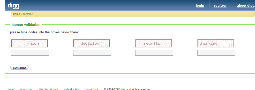
Count them. That’s 4 (four!) CAPTCHAs (without any non-visual fallback). I can see a single captcha being an annoying but necessary evil, but having 4 makes no sense. If a bot cannot read the first CAPTCHA, the rest aren’t needed. If a bot can read the first, it certainly can also read the next, making it superfluous.
That’s a lot of small annoyances in a signup process, which is likely to be the first interactive experience your customers have with your application. Remember that first impressions matter – also in web applications, so make sure it’s a good impression.
Is it really that bad?
Ranting aside, digg seems to be a nifty site, and I very much like the look of it. Simplistic, clean, and brightly colored gradients makes me a happy digger. I reckon I’ll try subscribing to their feed and see what content is being dugg up.