Kameo: Websites of sour
Today the website for Kameo: Elements of Power was launched. Having played the game a bit, I figured I’d visit and see what it was all about.
Here’s the story of my first visit, in the form of a thinking-out-loud usability test session. Something this website could have needed prior to being launched…
First time around
- Open kameo.com
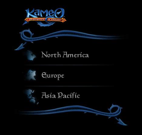
- Huh, what is this? A location selector? Hm, I’m in Europe, so I’ll click that.
- Uh, “United Kingdom” or “Ireland”? None of those are really a good match for me. I wonder if I am not allowed to visit the site if I am from another country. No worries, I’ll commit a bit of fraud and pretend I am from England.
- Waiting for some kind of navigation to appear…
- This music doesn’t really mix well with Korn coming out of iTunes. I better kill the Kameo sounds. At least the button to do that is reasonably easy to find.
- Hm, no navigation seems to be available. Running my mouse over every element of the screen to see if anything appears clickable.
- Oh, I can click the Kameo logo in the bottom left corner, that might reveal some navigation. ::Click::
- Uh, no, that just reloaded everything.
- Screw this, this site has nothing but a pretty picture and sound. ::Close tab::
Then I thought, “Hey, this stuff will make for a good rant”…
Here we go again
- Reopen kameo.com
- Aha! This location selector is no match for my deception-fu. This time I will fake being from “New Zealand”, mate.
- Same intro stuff again. It wasn’t interesting the first time around, it sure isn’t the second time around.
- Gah, the sound still doesn’t mesh well with my iTunes. Didn’t I already turn this off?
- It seems nothing has changed now I am coming from New Zealand. Why do I have to bother picking a location at all?
- This time I wait and see what happens…
A minute is an infinity
A minute later, a navigation menu appears at the bottom. One minute! That’s more than 60 seconds of doing nothing. 60! Without an incentive I have an attention span somewhere below 10 seconds. The target audience of the game probably has even less. Why would anyone force anyone to wait that long? It gets even better: I have to wait 60 goddamn seconds each and every time I revisit the page.
Navigational pains
The navigation gives me these options: “Anger management”, “Kameo Lore”, and “Characters”. Where would you click to find screenshots? Release information? Supported platforms? Price range? Retailers? The hard cold facts that you might actually be interested in?
You better choose wisely, since you’re in for at least 20-30 seconds of penalty time after each click. Oh, and make sure you don’t follow one of the most common website interactions: Clicking back to the frontpage to start over. That is the full minute of waiting. Again.
The verdict
Kameo.com is a waste of my time. Microsoft and Rare, you won’t see me again. I sure hope the game has better interaction designers than webdesigners.
PS: As a aside, it should be noted, that the Kameo community site which is hidden behind a hard to see, anonymous link at the bottom of the main site, is a usable, pretty website. It has a bunch of interesting info about the game. Why they’ve chosen to make the good stuff unaccessible is beyond me.