Webkit-based Xbox dashboard
Webkit – and Safari in particular – have been really aggressive in adding support for upcoming CSS 3 features – and some CSS features not yet part of any spec.
As much of this is still Webkit-specific it isn’t really something I get to use much on client work, but not being one to shy away from new, shiny things, I though it would be fun to dig into this.
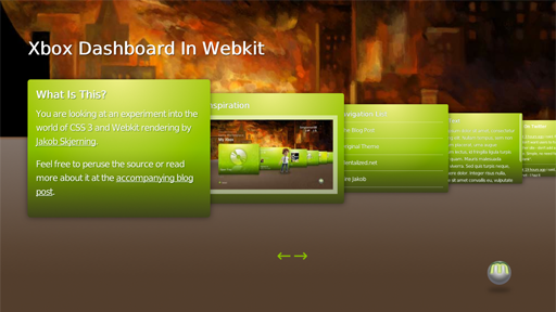
I decided to recreate an interface familiar to Xbox players, namely the Xbox Dashboard. It seemed like a good candidate to try out techniques like CSS animations, font-face, multiple backgrounds, gradients, RGBA colors, drop shadows, and custom scrollbars to name a few.
The inspiration
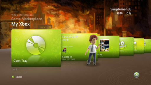
The original inspiration for the actual look and feel is the Braid theme released by the great guys behind Braid – I hope they’ll forgive me for using their graphics.
The original theme looks like:

My recreated version looks like:
See the working demo here _ remember, Webkit browsers only, so use Safari or Chrome.
I have tried to be generous with the comments in the source, feel free to dig in and see how things are made. Hopefully this can serve as inspiration/education for someone as it did for me.
Boo, you’re using Javascript
I tried briefly to make this work without Javascript using :target pseudo-selectors, but I never got it working. It might be possible to implement that, but my CSS-fu (or patience) wasn’t up for the task.
All the Javascript is doing is adding classes to the panels – .frontmost if it’s the active panel, .outside if it’s a panel that shouldn’t be visible. All animations and transformation is done in CSS.
It should be possible to create the behavior in Javascript instead of CSS. It would be interesting to see, if for no other reason then to see it running in browsers outside of Webkit. PDI.
Issues
Performance
The framerate in Safari is pretty bad. The framerate in mobile Safari on my iPod Touch is ghastly (and I totally miss not being able to swipe there). Chrome delivers the best performance by far.
Visual artifacts
When navigating between the panels and the animation is in progress, Safari doesn’t render the custom scrollbars. Instead it renders a transparent box there for some reason. Chrome handles that correctly.
I tried to add the reflections that’s visible on the actual Xbox Dashboard, but it simply caused too many visual artifacts in Safari. I’m guessing the combination of border-radius, scale, and rounding errors was tripping up the -webkit-reflection.
Should this ever be used in production?
Features that are only supported by browsers used by 10% of the internet-browsing population? I think not.
It definitely could be interesting to see how well this could be made to work in other browsers. Most modern browsers aren’t far behind Safari, and it might be possible to make it degrade gracefully enough in Internet Explorer. That is, however, far outside the scope of my experiment.
