Size still matters
A couple of years ago (wow, has it been that long already?) I posted the results from my research into browser viewport widths, Size Does Matter.
Back then, I pointed out that basing your designs on the width of the screen was pointless. Far from every visitor would actually use the full width of their screen for their browser – only 66% on average. The wider your screen, the less likely you were to maximize your browser.
Even though massive flatscreen monitors regularly appear in cereal boxes and as Kinder surprises these days, the reality isn’t much different from what it was 2 years ago; Make your designs wider than 800 pixels and expect a good chunk of your visitors to get a horizontal scrollbar.
Choosing a design width
When determining what width to give your design the primary goal must be that as many visitors as possible should be able to view the entire design without getting a horizontal scrollbar (scrolling horizontally is bad, mmkay).
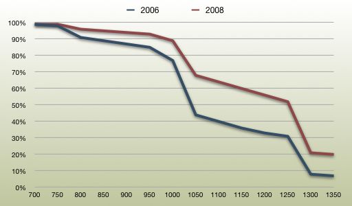
The following chart shows the percentage of visitors that will not get a horizontal scrollbar for specific pixel widths. It also shows the figures from my 2006 study:

It’s interesting to note, that the available width has clearly increased since 2006. Back then, if you were to make your design 800 pixels wide, roughly 10% of your visitors would get a horizontal scrollbar. Today, that number is around 5%. It’s getting easier to justify going above the 800 pixels mark.
Another interesting thing to note is the two steep drop-off points occuring in both graphs after 1000 and 1250 pixels. Both of those correspond pretty well to a maximized browser in the two most widespread screen widths; 1024 and 1280 pixels.
The remnants of a drop-off is also visible right before the 800 pixel mark, but it’s almost not visible indicating that 800 pixels wide screens are becoming a thing of the past.
What does a smart designer do?
The above numbers are based on my statistics gathered from mentalized.net. A smart designer will obviously measure this on the actual site in question before making a desicion.
Unfortunately, many statistics packages still only provide the useless screen size metric instead of the useful viewport width one. Mint is still the only one I know of that tracks viewport widths – and that’s through a plugin pepper.
What does a lazy designer do?
If you’re stuck with a statistics package that doesn’t provide you with the figures you need to make a decision, you’ll have to settle for my advice – just like I did when designing the Substance Lab website (a rare case of me doing what I say, I admit).
Back in 2006 I recommended that you “optimize your designs for a width of 770 pixels while making sure they scale […] to 960 pixels”. Now, more than 2 years later, that recommendation hasn’t changed much, unfortunately.
With a design width of 770 pixels only 2% of your visitors should encounter the dreaded horizontal scrollbar. At 960 pixels, the number has climbed to 7% – that’s 1 in every 14th visitor.
Personally, I don’t see the value in optimizing for 2% of my visitors. I wouldn’t, however, be happy knowing that 7% of my visitors were getting a less than optimal experience. You have to decide for yourself – and for your customers – where your accepted cut-off point is.