CSS, links, gradients, rounded corners, and IE
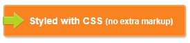
On a project we were recently given a nicely designed button that we should implement.
No problem, I thought, that’s doable using CSS3. Behold, it was (non-interesting styles like font color and size are removed for clarity):
HTML
<a class="button" href="#">
  Styled with CSS <small>(no extra markup)</small>
</a>
CSS
.button {
  background-color: #f98221;
  background: linear-gradient(top, #fec848, #f87d1a); /* Add vendor prefixes as needed */
  border-radius: 4px;
  border: 1px solid #eca253;
  box-shadow: rgba(0,0,0,0.2) 1px 2px 3px, inset rgba(255,255,255,0.7) 0 0 4px;
  display: inline-block;
  padding-left: 1em 36px 1em 18px;
  position: relative; /* Allows for absolute positioning relative to this element */
  text-decoration: none;
  text-shadow: rgba(0,0,0,0.3) 0.1em 0.1em 0.1em;
}
.button:before {
  background: url('icon_arrow_green.png') 50% 50% no-repeat;
  display: block;
  content: '';
  height: 100%;
  left: -2px;
  position: absolute;
  top: 0;
  width: 31px;
}
There was much rejoicing until the big blue elephant in the room reared its ugly head and pooped all over my nice and clean markup. Thank you, IE, so much.
Internet Explorer; still struggling to keep up
While IE9 does support most the CSS that’s needed for this button style, it notably doesn’t support CSS gradients. However, you can apply a proprietary Microsoft.gradient filter, which does basically the same thing. Perfect!
CSS
.button {
  filter: progid:DXImageTransform.Microsoft.gradient(GradientType=0,startColorstr='#fec848', endColorstr='#f87d1a');
}
Unfortunately, the IE filter doesn’t work with border radius, thus the gradient isn’t rounded as it should be (note the square corners above). IE will not even clip the background gradient if we add overflow: hidden.
Introducing a clipping element
The solution is to create a wrapping element with overflow: hidden and border-radius that masks out the parts where the gradient shows through. Our markup now looks somewhat like
HTML
<a class="clipper" href="#">
  <span class="button">
    CSS, filter, and extra markup
  </span>
</a>
CSS
.clipper {
  overflow: hidden
}
This brings us really close to where we want to be. Unfortunately - although not unexpected - the arrow icon also gets clipped by the wrapping element.
Moar markup!
To work around that, we add more markup. First, we have our a element that simply works as a container for the visible elements inside it.
Inside the link, we generate an absolutely position element with the arrow icon (like in the first attempt).
In addition to that, we have our clipper element from before and inside that is a span with the text, to which we apply our actual button styles.
And boom, Internet Explorer now finally knows how to play nicely.
Internet Explorer, it is always you…
Unfortunately, Internet Explorer 8 doesn’t play nice with the above. While it doesn’t support border-radius at all, thus the corners aren’t rounded, it has a bug related to generated content and z-indexes, making our icon render beneath the button:
To work around that, we can make our clipping element a relatively positioned element with a negative z-index:
.button span {
    position: relative;
    z-index: -1;
}
This makes our button render well in Internet Explorer 8 and 9, Chrome, Safari, and Firefox with final markup and styles looking like this:
HTML
<a class="button" href="#">
  <span>
    <span>
      CSS, IE filter, and 2 spans<br>
      <small>It aint pretty, but it works</small>
    </span>
  </span>
</a>
CSS
.button {
  display: inline-block;
  position: relative;
}
.button:before {
  background: url('icon_arrow_green.png') 50% 50% no-repeat;
  display: block;
  content: '';
  height: 100%;
  left: -2px;
  position: absolute;
  top: 0;
  width: 31px;
  z-index: 1; /* Make sure the ico overlays the button */
}
.button > span {
  border-radius: 4px;
  box-shadow: rgba(0,0,0,0.2) 1px 2px 3px;
  display: inline-block;
  overflow: hidden;
  position: relative;
  z-index: -1;
}
.button > span > span {
  background-color: #f98221;
  background: linear-gradient(top, #fec848, #f87d1a);
  border-radius: 4px;
  border: 1px solid #eca253;
  box-shadow: inset rgba(255,255,255,0.7) 0 0 4px;
  color: #ffffff;
  display: inline-block;
  filter: progid:DXImageTransform.Microsoft.gradient(GradientType=0,startColorstr='#fec848', endColorstr='#f87d1a');
  padding: 1em 18px 1em 36px;
  text-decoration: none;
  text-shadow: rgba(0,0,0,0.3) 0.1em 0.1em 0.1em;
}
The above renders like this in Internet Explorer 9:
Voila
There you go, a fully scalable link button styled primarily with CSS, using gradients and rounded corners and nearly pixel perfect rendered across browsers - even in Internet Explorer, at the cost of a little bit of markup pollution.