Browser size does matter - Actual numbers
In a recent Jakob Nielsen Alertbox column Jakob Nielsen recommends that you
Optimize for 1024×768, which is currently the most widely used screen size.
Unfortunately, Mr. Nielsen seems to forget or ignore a very important detail as Jesper points out – namely that screen size does not equal the actual visible area of the browser. This article attempts to make up for Nielsens oversight.
Getting the figures
Unfortunately website statistic packages that provide this very useful metric of browser viewport size are nearly non existant.
Apparently Mint has a plugin pepper that allows you to keep track of the window size. This to my knowledge makes Mint the first and only statistics package that provides this metric, and not just the useless screen size.
The figures in this article have all been collected on mentalized.net by a piece of Javascript that stored the details of each visitors screen and browser size once for every visiting user agent. In the time it’s been running that has amounted to a total of about 21000 samplings.
For this article, I am going to focus solely on the width of the browser, since that’s by far the most interesting metric in my eyes. Sure, there are things to be said for designing above the fold, however in effect all websites have no limit in their height.
Shut up and give us the numbers
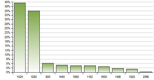
Most popular screen widths
Most popular screen width / viewport width combinations
| Screen width | Viewport width | Usage |
|---|---|---|
| 1280 | 1280 | 12% |
| 1024 | 1024 | 12% |
| 1024 | 1003 | 9% |
| 1280 | 1259 | 4% |
| 1024 | 1004 | 2% |
| 800 | 779 | 2% |
| 1024 | 1016 | 1% |
| 1024 | 995 | 1% |
| 1280 | 1272 | 1% |
| 1152 | 1152 | 1% |
The above data tells a couple of things. First of all, my data supports Jakob Nielsens claim that 1024 pixels is the most commonly used screen resolution. This also resonates with my Google Analytics data from both mentalized and BiQ.
Secondly it appears that most visitors maximize their browser. Each of the above screen width / viewport width combinations has 30 or less pixels difference between the width of the screen and the viewport.
This indicates that visitors either runs browser window maximized or at the very least has resized it to take up almost full width. Depending on your OS, browser, and settings the vertical scrollbar will also take up some amount of pixels.
Who maximizes their browser?
I’d like to investigate this further. Assuming that a viewport being 30 pixels or less smaller than the screen size means a maximized window, we can figure out how many people run their browser sizes maximized.
With the above definition, it turns out that an average of 66% of the visitors maximize their browser window. The percentages for the most common screen widths can be seen below:
Maximized browsers per screen width
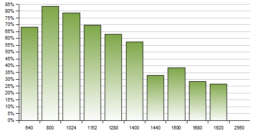
While there is a clear trend that the higher the screen width the less likely you are to maximize your browser window, it is also obvious that the majority of visitors still maximize their browser. The cut off point seems to be when people go from a screen width of 1400 pixels to 1600 pixels.
For the most predominant screen width (1024 pixels) almost 80% of the visitors maximize their browser.
How much space does this give us?
Determining the width you should optimize your design for is – as everything else in design – a trade off. There will most likely always be someone with a smaller browser than you’ve designed for, so you should find a width that allows the vast majority of your visitors to view your website with getting a horizontal scrollbar.
This figure illustrates roughly the percentage of visitors that will not get a horizontal scrollbar for different design widths:
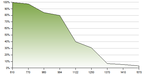
The design widths above are based on the most popular screen widths minus 30 pixels to allow for a scrollbar. I’ve also added Cameron Molls suggestions of 750 pixels for 800×600 resolutions and 960 pixels for 1024×768 resolutions.
So what’s the conclusion
When Jakob Nielsen claims that you should design for 1024 pixels wide screens since that’s the most predominant screen resolution, he is partially correct. 1024 pixels /is/ the most commonly used screen resolution, however taking his recommendation at face value and optimizing for a browser content area that’s 994 pixels (maximized browser window minus scrollbar) wide means you’ll be optimizing for only 80% of your visitors (well, that’s actually 80% of /my/ visitors, see below).
However, if you optimize your design for a width of 770 pixels, you’ll be optimizing for 97% of the visitors. That sounds to me like a much better target figure. Do note that this does not necessarily mean you should create 770 pixel fixed width designs.
My recommendation is that you should optimize your designs for a width of 770 pixels while making sure they scale fluidly from 770 pixels to 960 pixels.
Disclaimers
These figures are obviously based on my visitors visiting my website. It is very likely that the demographics and behaviours of my visitors differs from those of your visitors, so as always when talking about statistics, remember that the figures you measure on your own website are more important than whatever figure you can find on the web.